
Web UI Comparison (old / new)
Last updated
Starting with v1.3.4, Web UI styling is optimized by Claude Opus first, because the developer really doesn't enjoy designing interfaces.
This revision only changes styles (page/src/sass and the Usage chart colors); no feature logic or interaction flow was changed.Overall direction
| Item | old | new |
|---|---|---|
| Theme | Light only | Dark by default, switches to light automatically via the system prefers-color-scheme |
| Color | Mostly black, white and gray; primary buttons in pure black | Cool neutral grays plus a single blue accent (light #2563eb, dark #4f8cff); all colors are now design tokens |
| Background | Flat color | Dot grid behind the sidebar and preview panel; the main panel is a "sheet" with a rounded top-left corner, flush with the right and bottom edges |
| Cards and forms | Light gray fill, no border | White fill + 1px border + soft shadow; border darkens on hover |
| Buttons | Height and radius varied across pages | Unified 2.25rem height, 0.5rem radius, weight 500; primary actions use the dark button |
| Typography | System default font, light weight (300), 10px small text | SF Pro / Inter / Segoe UI Variable + PingFang TC / Noto Sans TC; minimum weight 400, minimum size 12px; unified monospace font; tabular numerals in tables |
| Motion | Transitions varied | Unified 0.15s with a single easing curve |
Page by page
Chat home
old
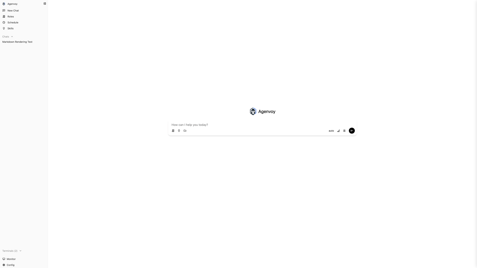
new (light)
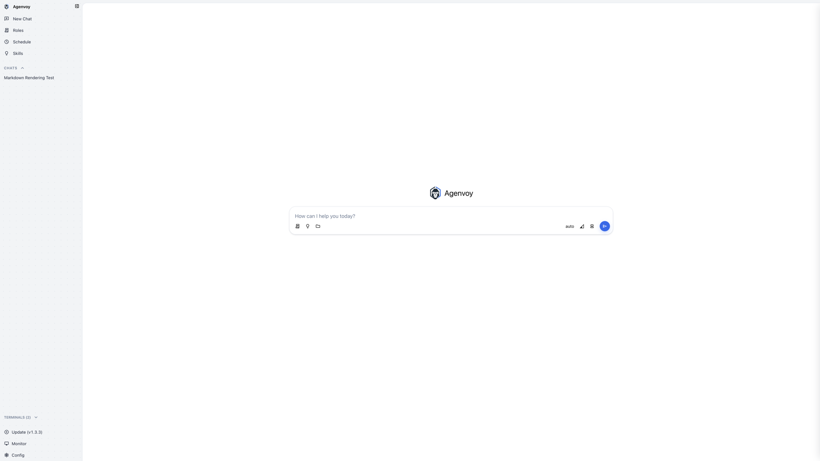
new (dark)
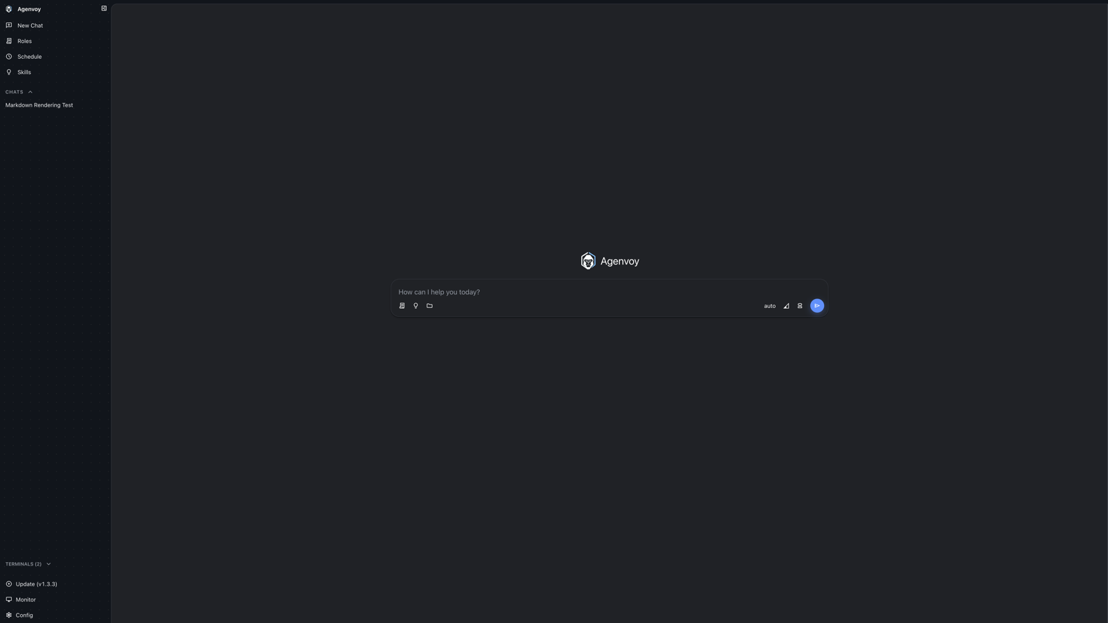
- The send button changes from black to the blue accent with a glow.
- The input box uses a border with layered shadows and shows a blue focus ring; the voice recording ring is unchanged.
- Sidebar group labels become small uppercase (
CHATS,TERMINALS), and items get taller rows.
Chat conversation
old
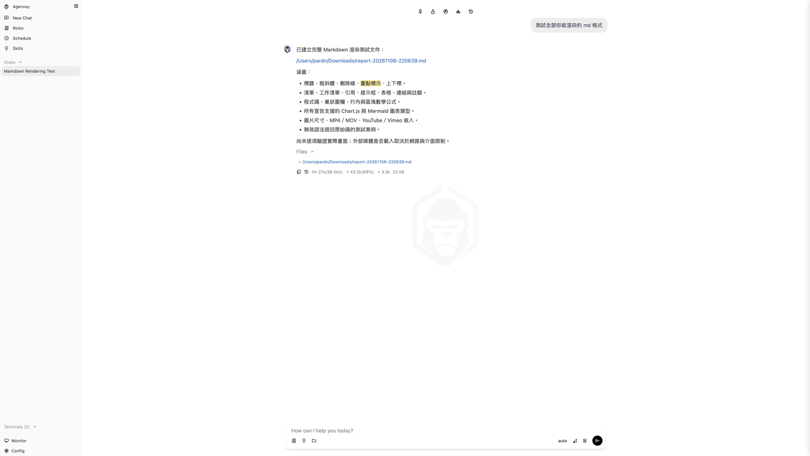
new (light)
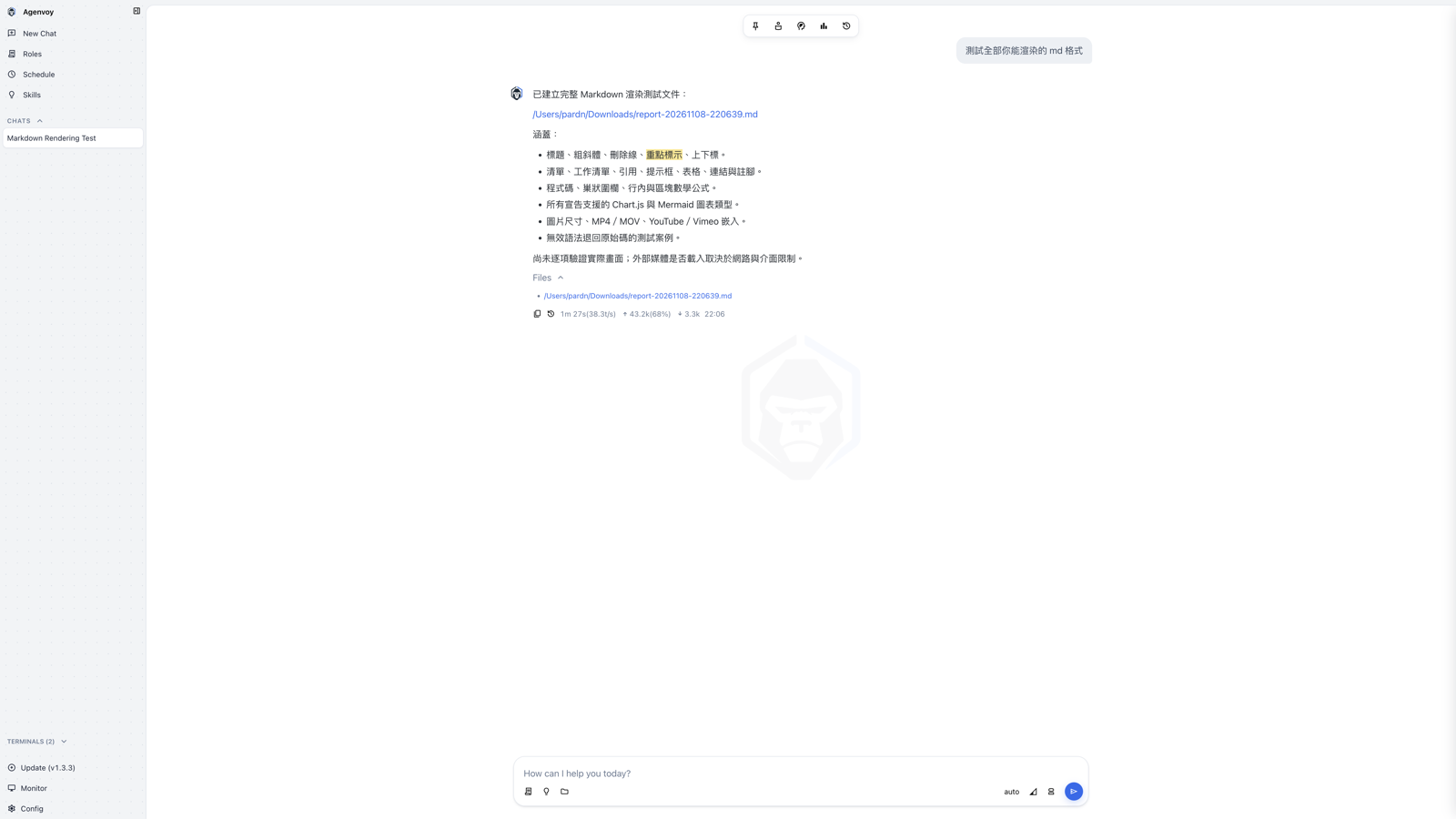
new (dark)
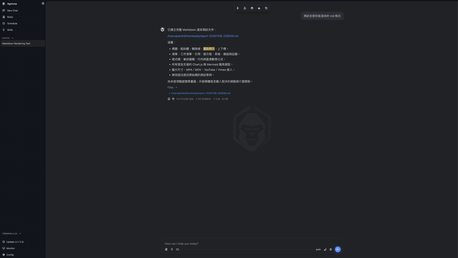
- The top toolbar becomes a frosted-glass pill with border and shadow; it is hidden when there is no session.
- User message bubbles use asymmetric rounded corners.
- The selected sidebar item changes from a gray fill to a white card.
File preview
old
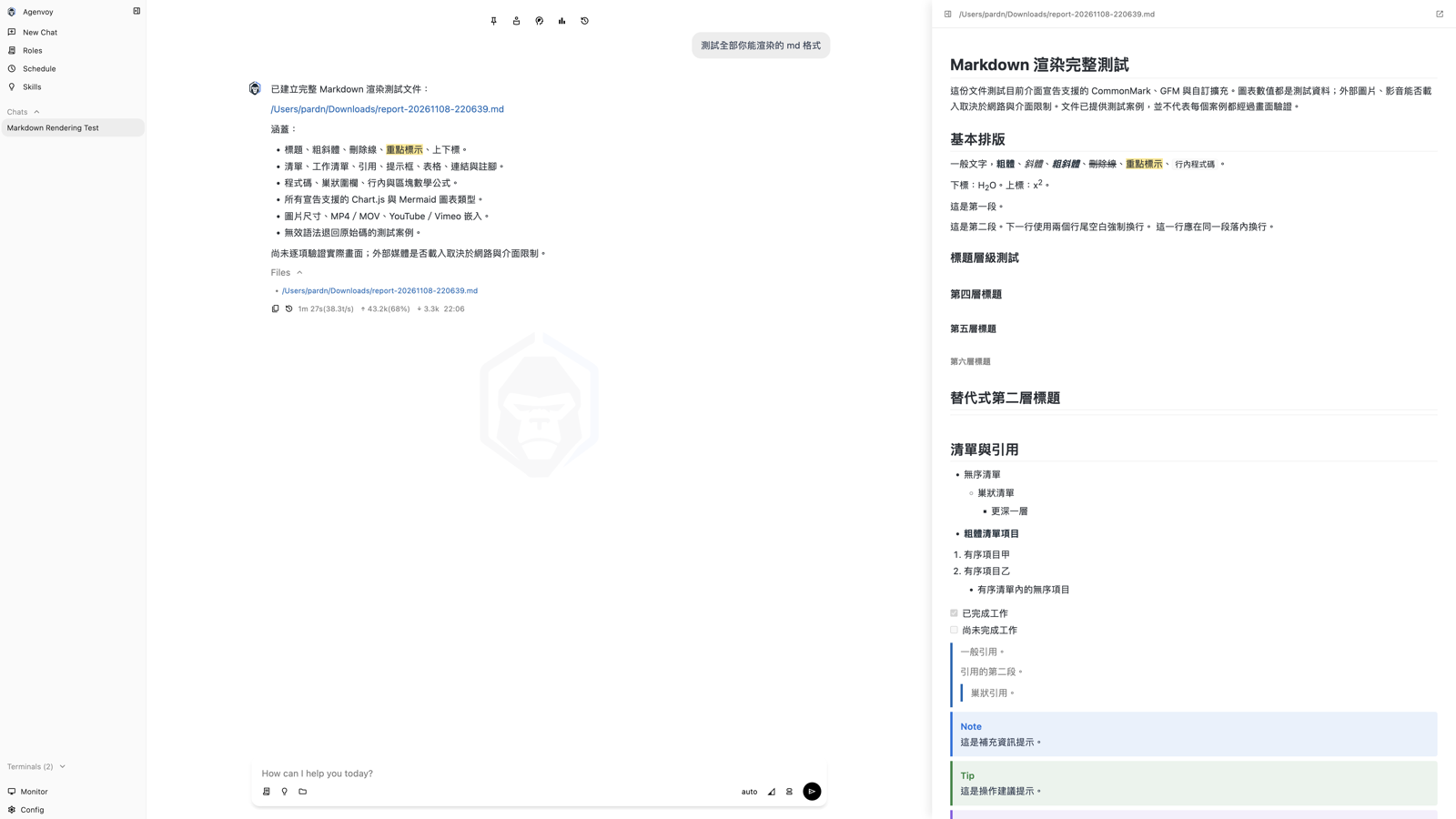
new (light)
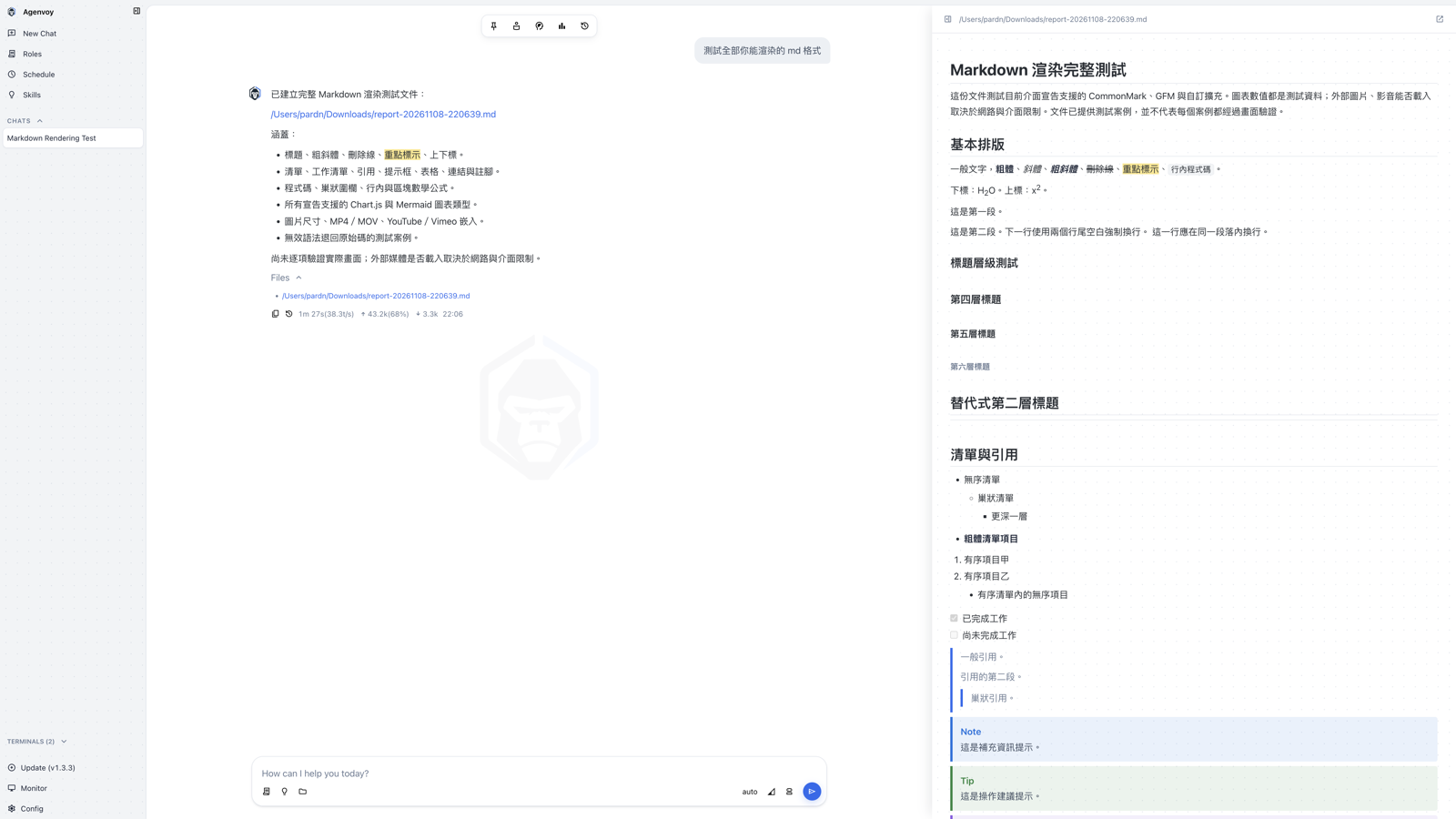
new (dark)
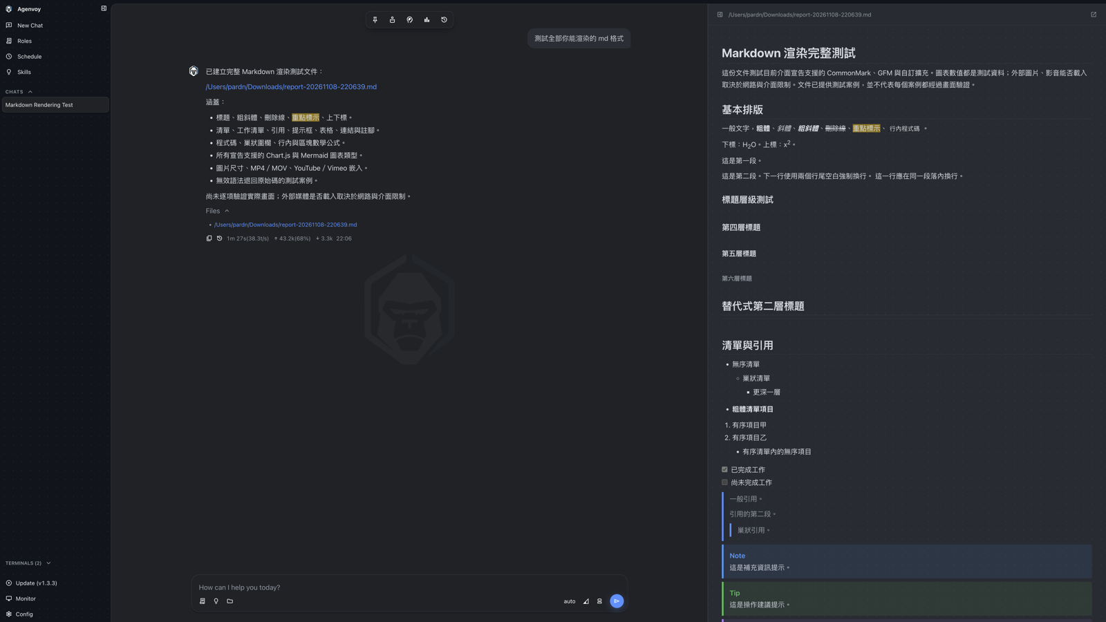
- The preview panel is separated from the conversation by a shadow (light) or background color (dark) instead of a plain divider.
- Markdown body uses 1.7 line height and tighter letter spacing; code block colors follow the theme.
Skills
old
new (light)
new (dark)
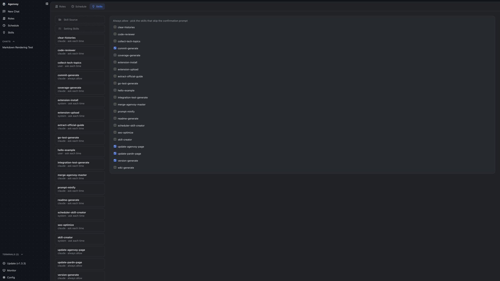
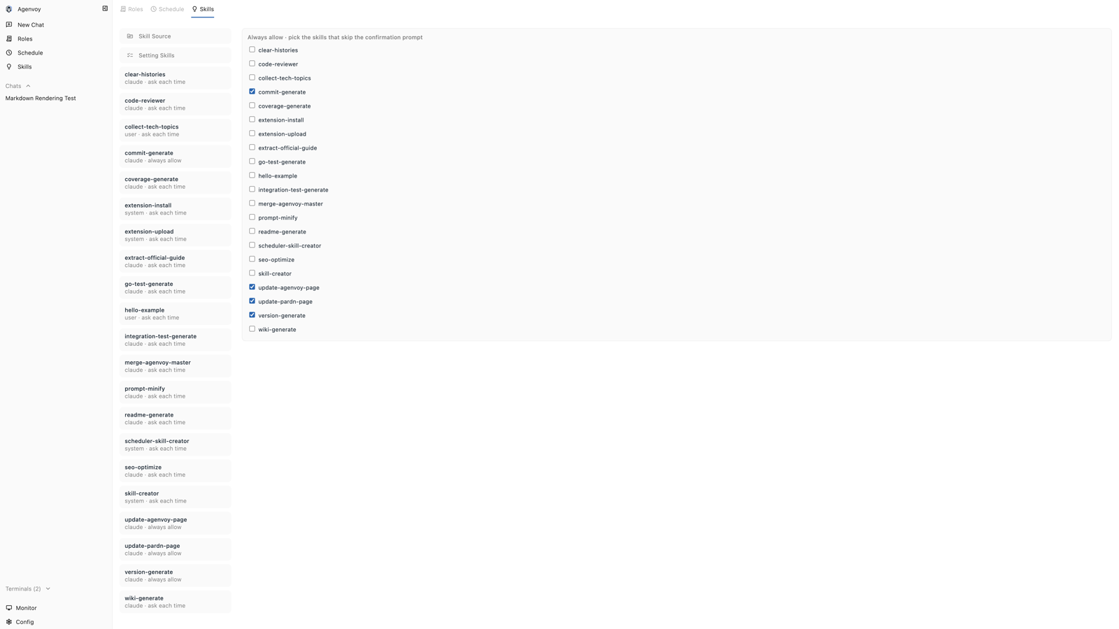
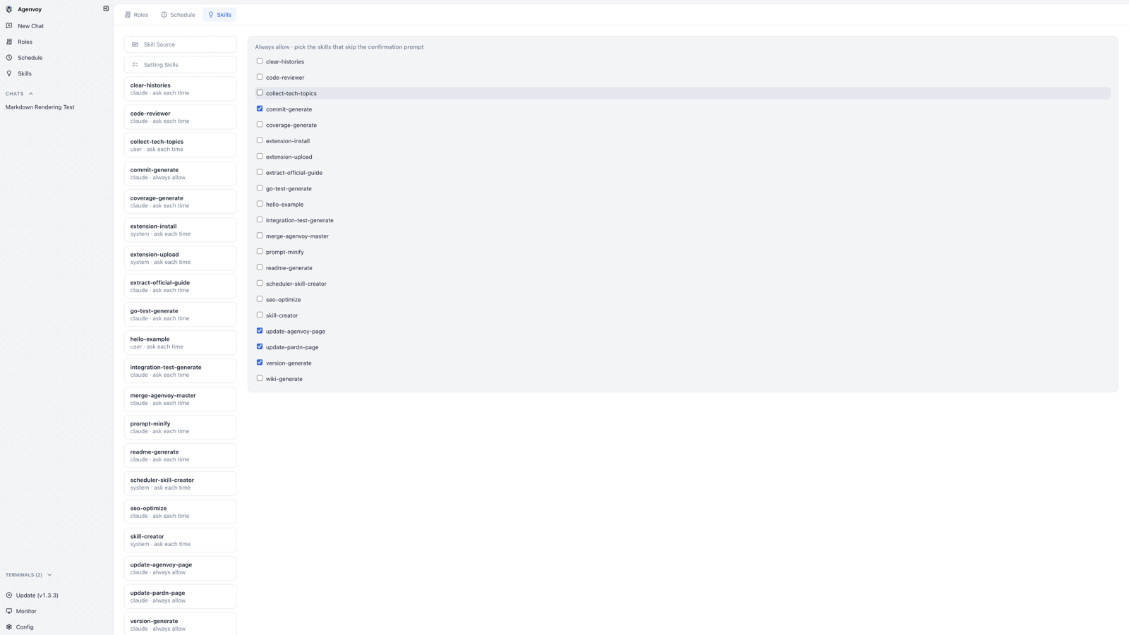
- Top tabs change from an underline style to rounded blocks, with blue for the selected tab.
- The left list becomes separate cards; rows in the checklist get a fill on hover.
Schedule
old
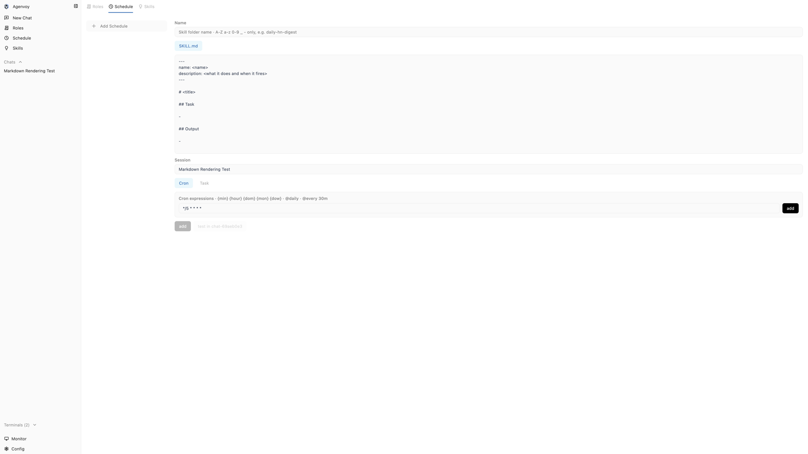
new (light)
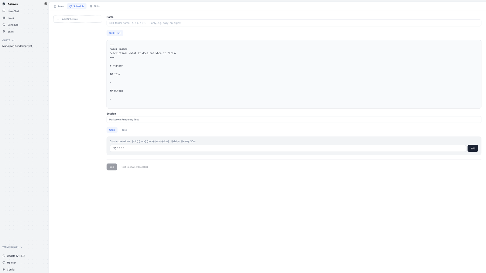
new (dark)
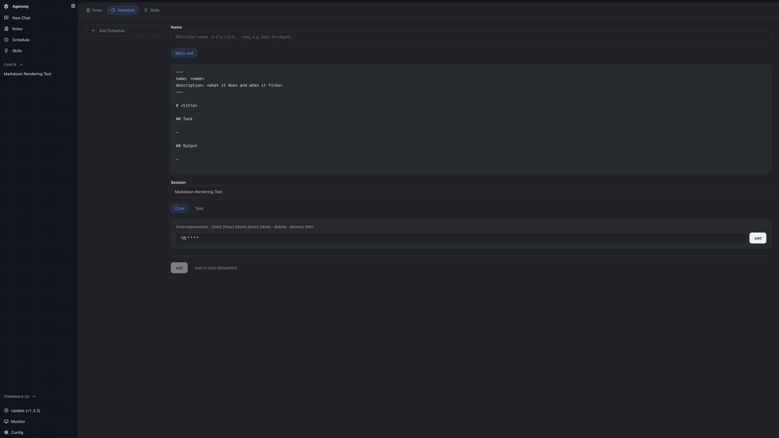
- Field labels are bold (600) with more spacing between fields.
- The
SKILL.mdeditor uses the monospace font and its own background. - The form footer gets a divider, grouping the submit button and test info at the bottom.
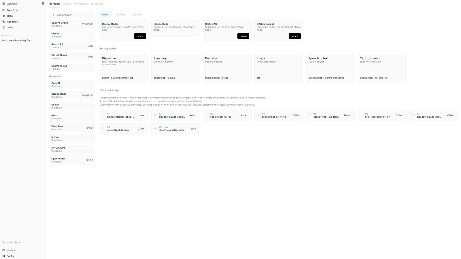
Model
old
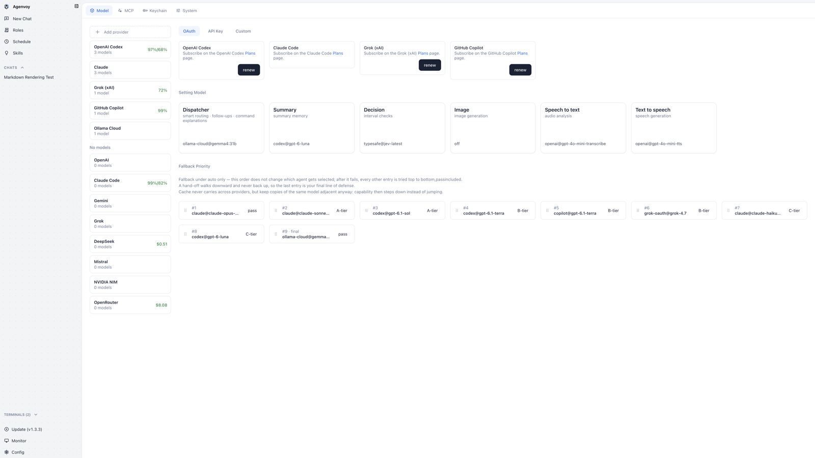
new (light)
new (dark)
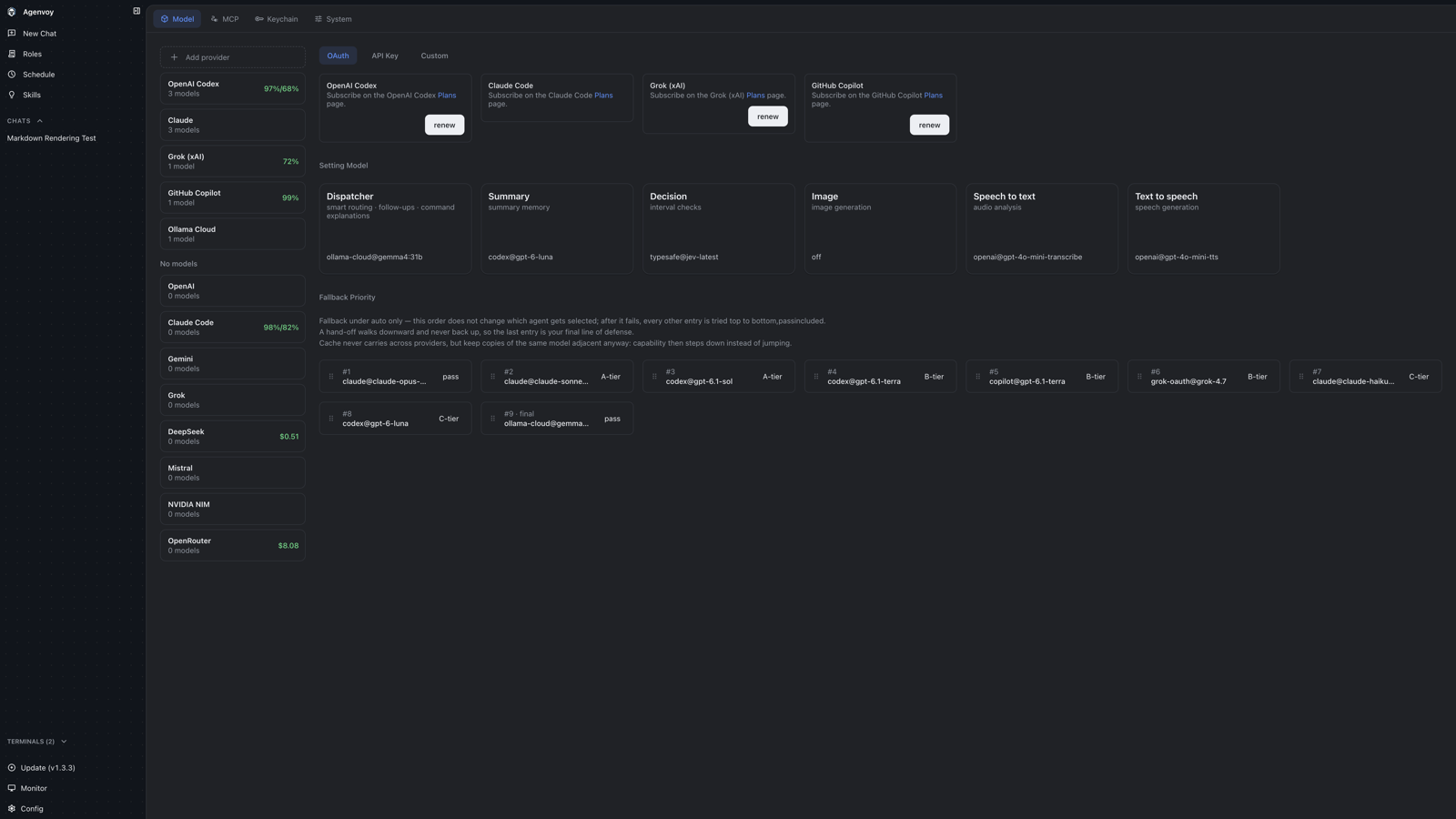
- Provider and setting cards are unified as white fill + border, with titles at weight 600.
- Fallback priority cards get more padding and height for a tidier layout.
System
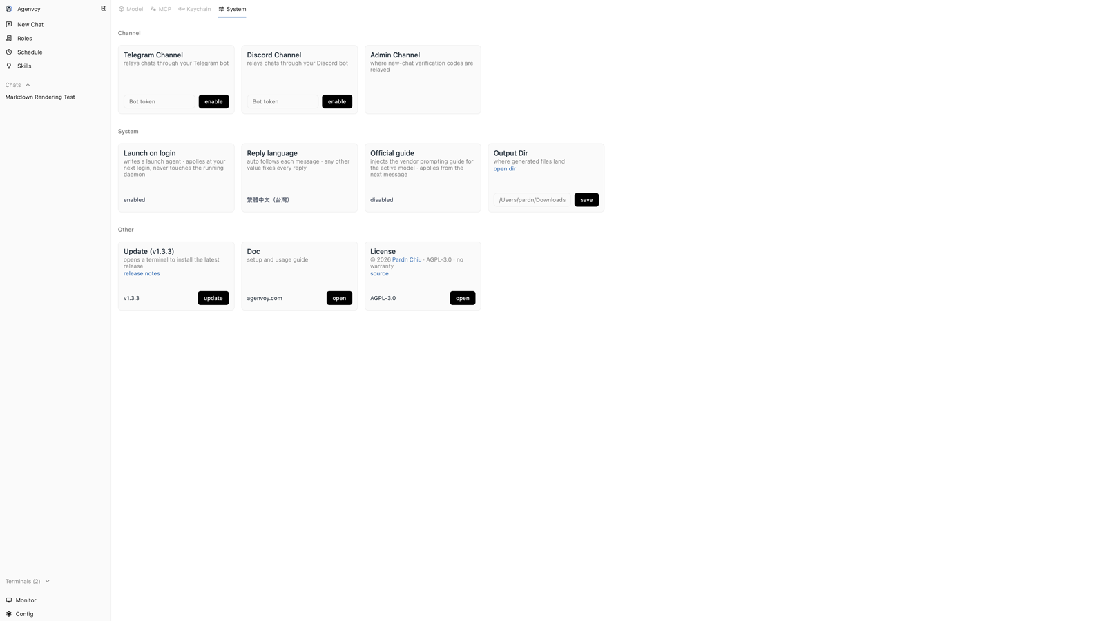
old
new (light)
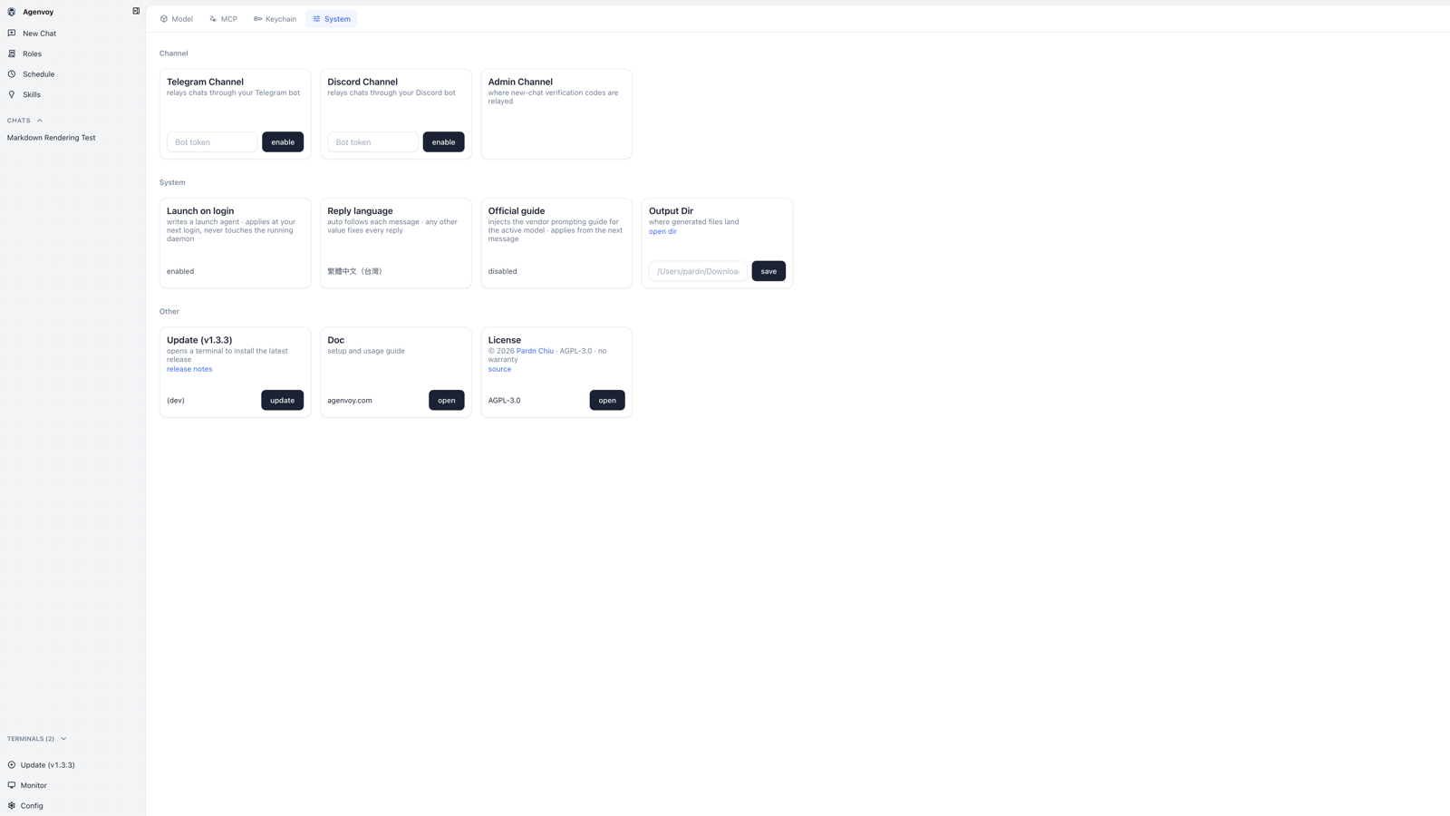
new (dark)
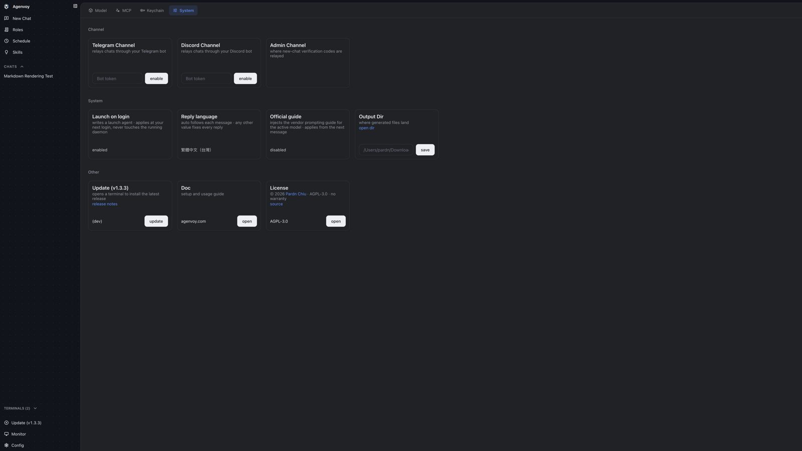
- Inputs and buttons inside cards share the same height and alignment.
- Inputs use a white fill + border to stand apart from the card background.
Usage
old
new (light)
new (dark)
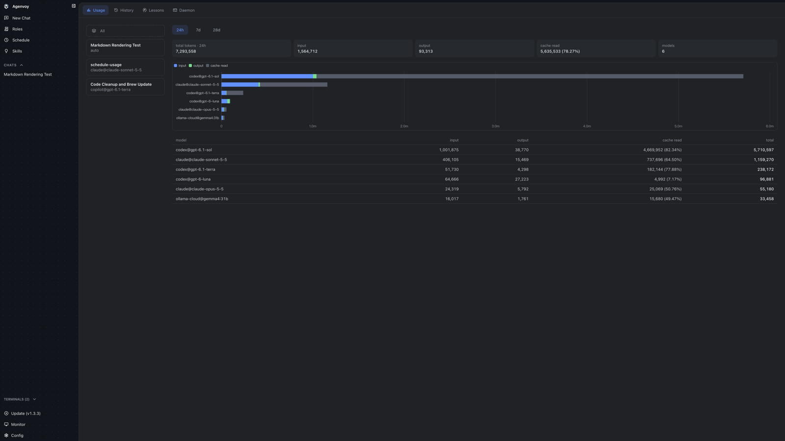
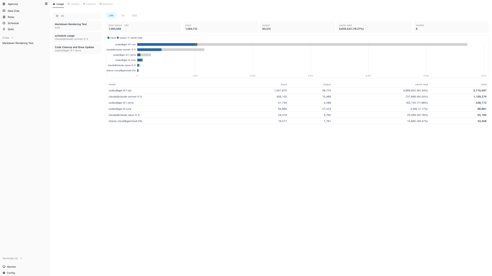
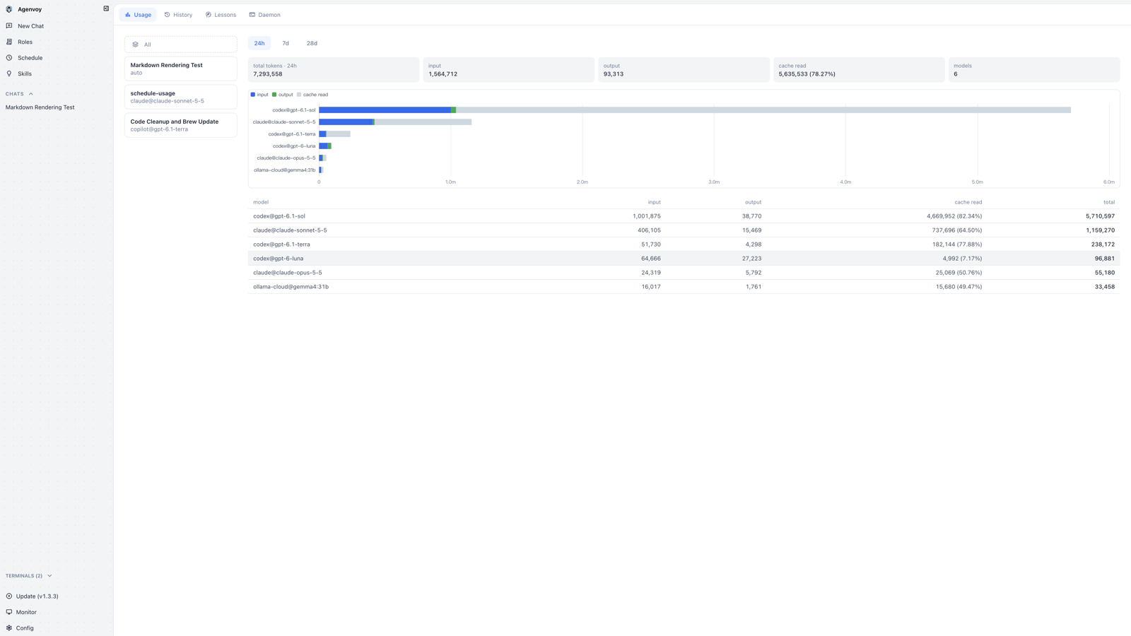
- Chart colors read theme color variables (input blue, output green, cache read light gray) and repaint immediately when switching between dark and light.
- Summary cards and table figures use tabular numerals; table rows get a fill on hover.
Lessons
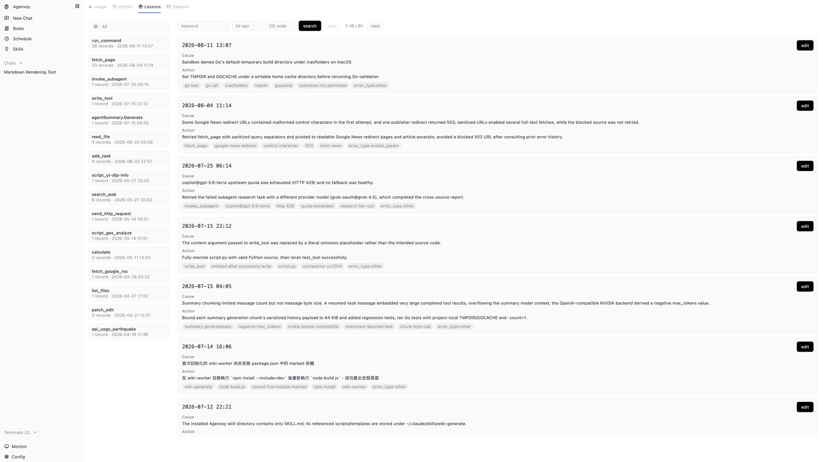
old
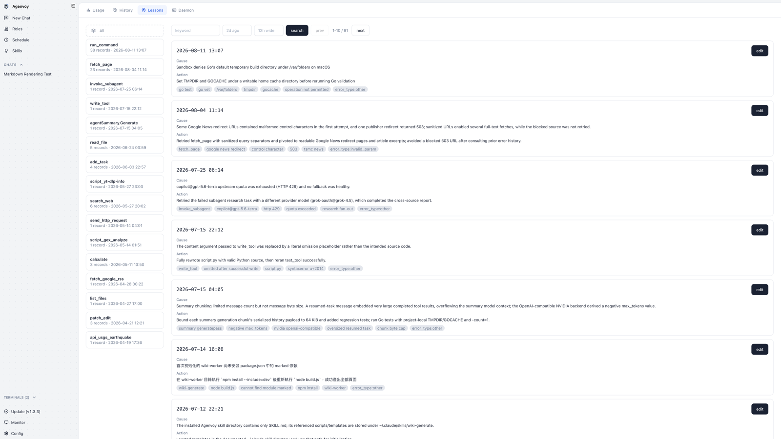
new (light)
new (dark)
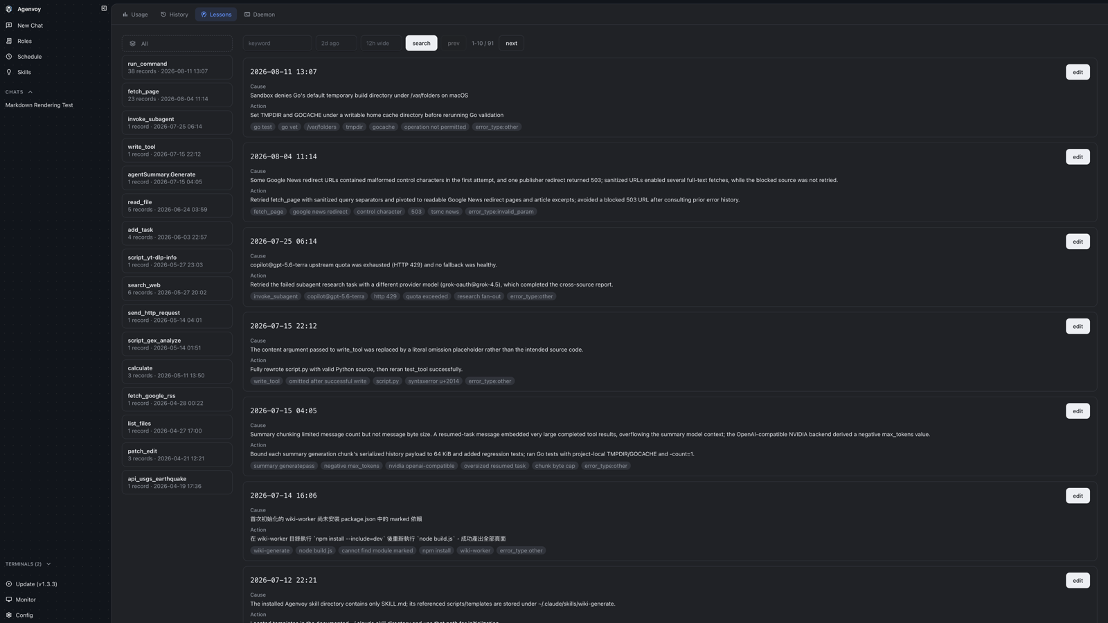
- Each record becomes a bordered card with more padding; tags become rounded pills.
- The filter row and pager buttons are unified at 2.25rem height.